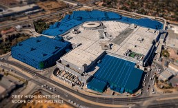
The Fourways Mall expansion now positions this shopping mall located in the Northern Suburbs of Johannesburg as one of the largest in the Southern hemisphere. The expansion project, in progress for a little over four years, has added more than 220,000sqm of space across all levels, with the total space available for retail being 182,000sqm, including Fourways View and the previously standalone Game wing, which have now been embraced under the Fourways Mall roof.
The entire project has cost R2.1 billion to complete, supported by roadworks expansions funded by developers Azrapart costing R400 million – massive investment into a vision for the future of Fourways. Having welcomed more than 250 new brands and stores to the mall’s retail mix, Fourways Mall now offers a total of 450 shops and experiences.
Notwithstanding the sheer scale of the project, the infrastructure and the many years of collaboration and partnership to get the project consumer-ready the immense amount of project detailing is noteworthy. In what Hennie Coetzee (Project Lead and Director at Boogertman + Partners) calls 'primarily an interior architecture project' the mall really comes to life once you enter it. The team did extensive research into future retail trends and visited top malls in the UK and the UAE to sense-check their own designs and to ensure that the mall had longevity. Driven by the need for more retail space and the growing demand of the surrounding communities for increased lifestyle and brand offerings the Mall has created a number of key focus areas that ensures that it delivers rewarding experiences.
A general nautical theme originated from the background of the original landowners – an Irish boat builder and it has provided the cue for some of the theming for feature areas
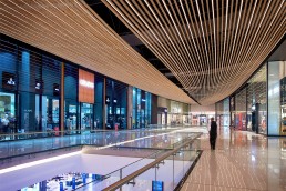
The Boat Ceiling
The Boat Ceiling bulkhead located in Mall 1 is a tribute to his shipbuilding legacy. The 110m long feature is shop-fitted from timber and inset with LED strip lighting to create an incredible ceiling feature that creates a destination for this part of the mall. In tracking social media (#fourwaysmall)it is currently the most photographed and ‘selfied’ feature of Fourways Mall since it’s opening in 2019.
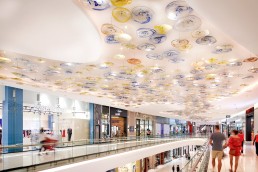
The ‘bubbles of the ocean’ as glass ceiling features
The design for using glass as a decorative ceiling feature was originated by Anneke Dearlove in the Boogertman + Partners interior team. “We were looking for something upmarket, beautiful and linked to raw materials – glass was introduced to us by an international vendor but once we had done the designs outsourcing internationally was too expensive. We sought local craftsmen and I am delighted that Gary and his team at Trithor had the skill set and the appetite for detail that has created these unique features” The glass plates are individually coloured with pigment and hand blown and range from 900mm to 500mm in diameter. They form a flowing pattern of a wave on the 60m ceiling detail in Mall 3.
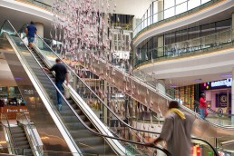
The glass, fish-shaped chandeliers
This attention to detail and handwork is carried through in the glass, fish-shaped chandelier features. The installation in the elevator courtyard required intense co-work between the mall's production team, the installer and shop-fitter and the Boogertman + Partners design team. The resulting sparkling shoal of 800 floating fish adds to the theme and the overall shopper experience. “As retail design is under increasing pressure to compete with online retail it is important to create an environment that is rewarding and relaxing to be in for shoppers,” explains Malcolm Coulson the Architecture Team Leader from Boogertman + Partners. “The reflection of the ceiling detailing in the shop fronts and the floor surfaces creates flow lines that bring cohesion and visual stimulation to the shopping experience”
New methods of way-finding design
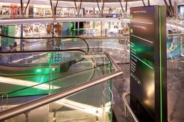
The addition of extra wings to the Fourways Mall plan resulted in the shape of a four emerging as the central organizing principle. Four anchor tenants, Game, Woolworths, Checkers and the Food Court are located on the four edges of the four wings with the three floors between creating concourses and display areas with line shops and brand offerings connecting pathways. The navigation and wayfinding system was designed by Seek Design. Through bringing the colour in the parking garage levels into the shopping mall signage systems, and making visible the colour on central lift shafts and escalators including lighting features, consumers can easily identify that a particular court or section is linked to the parking entrance they entered from.
As Brent Lindeque from The Good Things Guy notes in a review, "it got bigger but not harder to navigate."
Public Transport and infrastructure
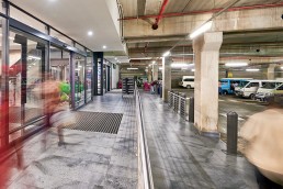
Over and above the investment in the road infrastructure around the mall, a further innovation of the design is the inclusion within the mall parking design of a dedicated taxi rank for 80 taxis. With car wash facilities and bathrooms designed after consulting with the relevant taxi associations it brings consumers and commuters right into the mall with easy access up one escalator with retail offerings easily accessible.
Natural materials and bringing the outside in
Lights and colour
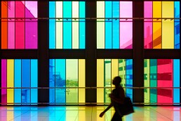
The old Fourways Mall connects to Fourways View combining these previously two separate offerings into one accessible shopping experience. A new feature link bridge between the Mall and the new multi-storey parkade is enclosed on the north side with coloured glass panels that create a playful and memorable experience, and by association an easily recognisable 'landmark' wayfinding structure.
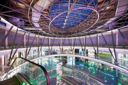
The use of natural light to increase user comfort within such a large interior space is managed by the use of skylights- the largest being the 22m x 18m skylight over the Promotions Court. An engineering feat in itself, which is a worthy Steel Awards 2019 winner. The large exoskeleton for this skylight was produced on the ground and then lifted into the place.
Design detail for consistency and quality and impact
To keep the emphasis of light, transparency and volumetric design the shop fronts in the main area of the 5 storey mall are designed as frameless glazing that starts from 4.8 meters high and in some areas go up to 7,3 high. In lower parts of the retail outlets, a smaller framed shopfront was introduced to provide flexibility for smaller tenants and to create some variety.
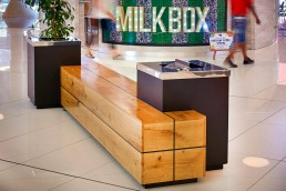
Shaped wooden public seating
The care to bring the outside in was extended to the use of large pieces of shaped timber as the public seating throughout the mall. Offset by planting these features are deliberate soft touches brought in to bring human scale to the expanse of the mall. “Often shoppers have long distances to walk and providing natural pause areas allows people to regroup, refresh and then continue with their experience. This is often an overlooked component of improving the experience for the end-user and something we believe quite strongly in when reviewing retail design” says Malcolm Coulson.
| Developer | Azrapart Pty Ltd-Bloemfontein |
| Completed | 2019 |
| Project Managers | SIP Project Managers |
| Quantity Surveyor | Quanticost Pretoria |
| Structural Engineer | WSP Consulting Engineers-Johannesburg |
| Electrical Engineer | CKR Consulting Engineers - Johannesburg |
| Traffic Engineer | WSP Consulting Engineers - Pretoria |
| HVAC | Spoormaker & Partners Pretoria |
| Fire & Security | Spoormaker & Partners |
