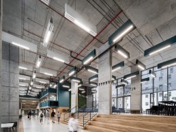
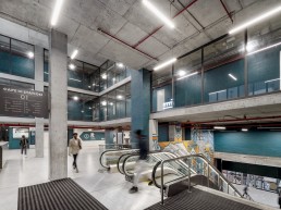
The forecourt of Cape Town Station, a landmark in the Cape Town CBD, has been reimagined by Boogertman + Partners for the Eris Property Group as a vibrant new mixed-use space that includes 6 700m2 of modern retail space, accommodation for 3 085 students and a world-class public square.
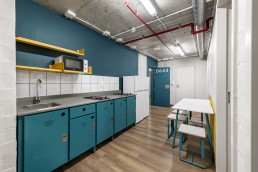
The new development was conceptualised to serve students attending the nearby Cape Peninsula University of Technology (CPUT) but is open to students from any institution seeking quality affordable accommodation in the city. It has been designed and built according to Department of Higher Education (DHET) standards as NSFAS-accredited accommodation.
The development shifts Cape Town Station’s character from a predominantly transport- and railway-related node to a densified multi-purpose urban neighbourhood, embracing the potential of the site to inject new urban life into this part of the city. It aims to strengthen and restore aspects of the urban design in the area while consolidating the nature of this historical precinct and creating a new urban landmark.
The site is unusual in this part of the city in that it stands alone in the surrounding urban landscape rather abutting buildings on all three sides. As a result, its design demanded a high degree of sensitivity to its urban context. At the same time, however, it offered multiple opportunities to celebrate aspects of the city’s heritage and enhance its urban design while managing an important transition in the evolution of the city.
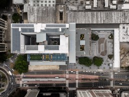
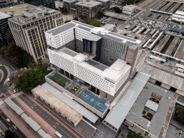
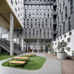
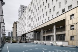
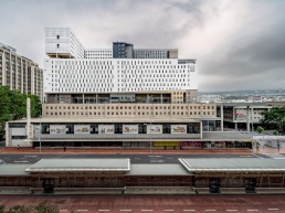
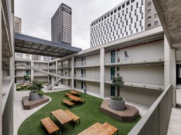
The retail space is accommodated on the base level, while the student housing block (topping out at 20 storeys) rises above it, forming two L-shaped blocks that are tied together to form a large courtyard.
The ‘massing’ of the student block was carved out in response to complex heritage, urban and contextual drivers, which include the allowable heights related to the scale of the nearby buildings, as well as a careful consideration of the key views up and down the surrounding streets and vistas of Table Mountain. Thus, each elevation responds individually to its own specific parameters, while the whole is resolved into a cohesive, flowing, unified design.
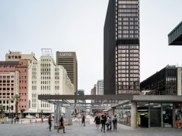
Along the main urban artery of Adderley Street, the building echoes the horizontal nature of the station concourse and reflects the scale of the buildings opposite. The northern façade relates to the height of the 60m Paul Sauer building and views of Table Mountain, while the southern façade steps down to relate to the buildings on Adderley Street. The eastern elevation is scaled according to the city blocks on the skyline, but also in relation to the large, flat expanse of the station platform and to the rhythm and proportions of the existing concourse building’s sandstone façade panels. From the ground to the fourth storey, the building creates a frame for the square.
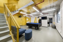
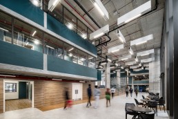
Aesthetically, the design for Cape Station involves a contemporary reinterpretation of the predominantly modernist face of the built environment in this area of the city, responding to the light material fabric of the surrounding buildings. Its scale is sensitively broken down into smaller portions on the façade, with variations in pattern and colour articulated with seamlines. Parts of the building even appear to be floating as a result of cuts in the mass, which also allow natural light into the courtyards. The social breakout spaces and courtyards are encased in a figure-of-eight massing to maximise the building’s exposure to natural light.
From an urban design perspective, two historical city grids intersect at the station: the historic Dutch city grid, and the modernist layout of the Foreshore. The new building has been designed to moderate this transition. Among its priorities were an imperative to strengthen the street-facing edge along Adderley Street and its response to the surrounding city grid, and to reestablish a green link that runs from Table Mountain through the suburban fabric of the Gardens area and on to the sea, which had become tenuous in the area around the station.
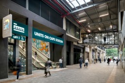
The new precinct was intentionally designed to facilitate pedestrian movement ‒ opening two urban corridors ‒ and to encourage the use of public transport. One corridor enables direct pedestrian access between Strand Street and the railway station (at the same time establishing a grand entrance) while the other extends Riebeek Street into the Galleria. Along the same axis, a new bridge penetrates through the station concourse building. Parking space was minimised, but, as a major transport interchange, the site has easy access to trains, buses and taxis.
The character of the precinct merges the public and civic nature of the station square with the more private and social nature of the student accommodation. The buildings wrap around to create a public square; its four-storey façade in this area imparts a grand civic atmosphere to the retail section.
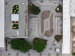
While the shops and square are open to the public ‒ the shops intend to serve the needs of the students who live in the building, as well as commuters and the broader community living and working in the city ‒ the student accommodation is accessed via a lobby on the first floor, subtly distinguishing public and private realms, and supporting access control and the security of the residential units. Two of the rooftop levels (level four and 14) feature roof gardens with sports facilities and breakout spaces. Large, loose planters with trees and shrubbery echo the green spaces in the square.
The updated Cape Station precinct introduces a new civic icon and an important transitional architectural intervention into the evolution of the Cape Town CBD – densifying, diversifying and breathing new life into this part of the city. It sensitively navigates the relationship between heritage and contextual factors, while strengthening, reestablishing and restoring others, and forging an exciting future for the city centre.
